
Lebreto Blue#2D6BFF
Primary. Recognition, links and every main call to action.
- HEX
- #2D6BFF
- RGB
- 45 · 107 · 255
- CMYK
- 82 · 58 · 0 · 0
- Pantone
- 2727 C (approx.)
- AAWhite text 4.51:1
How LEBRETO DESIGN WEB created its own brand, from a single geometric monogram to a complete identity system for web, social media, documents and signage.

Project summary
The LEBRETO identity is built around one idea: strategy, design and measurable growth working as a single system. Its monogram interlocks the letters L and R on a strict six-unit grid, with a 45° diagonal that signals forward movement and an arrow hidden in the white space. From that one shape come the logo family, the colour and type rules, and the graphic language used across the website and every channel.
LEBRETO DESIGN WEB was established in Ajman to help UAE businesses connect branding, websites, search, social media, lead generation and analytics. The company needed an identity that could stand beside larger agencies in Dubai and Sharjah, speak credibly to technical and B2B buyers, and still feel modern enough for startups and consumer brands.
A digital growth partner asks clients to trust it with how their own brands appear. The identity therefore had to prove the standards it promotes: clear in seconds, consistent everywhere, accessible and technically sound. It also had to avoid two common traps in the category: playful agency clichés that weaken B2B credibility, and generic technology marks that could belong to anyone.
The monogram combines an L and an R into a single square form. The L forms the base and the left side; the R forms the top, the bowl and a leg that cuts diagonally down to the right. The two shapes meet at exactly one point in the upper left corner, so they read as one mark while remaining two distinct letters for anyone who looks closely.
The diagonal is the deliberate focal point. It breaks the otherwise rigid square with a single movement from upper left to lower right, the natural reading direction in English, suggesting momentum, progress and growth. Chamfered corners at the top right and bottom left echo the same angle, so the mark feels engineered rather than decorated.
Anatomy of the mark
Every stroke is exactly one sixth of the mark’s width. X also sets the clear space and scales the whole system.
The top of the R starts exactly one unit to the right of the L. This offset is the digital building block of the mark: a single step on a screen grid.
The L and the R touch at a single corner. They read as one symbol, yet stay two distinct letters.
The white space inside the mark, tinted here in cyan, forms a single arrow. It is revealed step by step below.
A small chevron is cut into the right edge. It reads as “<”, the opening bracket of every line of website code.
The top-right and bottom-left corners are cut at 45°, repeating the angle of the arrow and balancing the mark diagonally.
Measured from the supplied master artwork. All edges are horizontal, vertical or at 45°.
The detail most people miss
Great marks reward a second look. Inside the LEBRETO monogram, the empty space is not left over: it is designed as a shape in its own right.
The arrow’s shaft runs out through the lower-right corner of the square. It is the idea behind the whole company: helping businesses move beyond where they are today, in a clear direction.
The arrow is never drawn. It exists only because the blue shapes stop in exactly the right places, a quiet demonstration of the precision LEBRETO applies to every project.
Negative-space details are noticed once and remembered for good. They give people a reason to talk about a brand, which is exactly what a strong identity should do.
Using only 90° and 45° angles is a practical decision as much as an aesthetic one. Straight and diagonal edges align with the pixel grid, so the monogram stays crisp as a browser favicon, an app icon or a social media avatar, where curved or thin details often blur. Consistent stroke thickness keeps the mark balanced at every size and makes it straightforward to reproduce in embroidery, laser engraving or signage.
The wordmark is set in two tiers. LEBRETO, the master brand and the customer-facing short name, appears in Midnight Navy with generous proportions. DESIGN WEB, the current descriptor, sits below in Lebreto Blue at a lighter visual weight. This hierarchy tells visitors which name to remember and leaves room for the business to grow beyond web design without replacing its identity.
The wordmark is treated as fixed artwork. It is always placed from the master files and never retyped in a font, which protects its spacing and proportions across every supplier and application.
Four approved versions cover every format, each with a single, clear job.


| Asset | Digital minimum | Print minimum | Preferred use |
|---|---|---|---|
| Horizontal lockup | 180 px wide | 35 mm wide | Default logo |
| Stacked lockup | 120 px wide | 24 mm wide | Narrow and square formats |
| Monogram | 24 px | 8 mm | Avatar, favicon, compact branding |
| Outline mark | 48 px | 15 mm | Background and secondary graphic |
| Background | Logo treatment |
|---|---|
| White or very light neutral | Blue symbol, navy LEBRETO, blue DESIGN WEB |
| Lebreto Blue | All-white reverse logo |
| Midnight Navy | Blue symbol with white wordmark, or all-white where contrast is stronger |
| Photography | Only over a solid or darkened quiet area, never across busy detail |
| Single-colour production | Approved 100% black or 100% white artwork only |
The protected zone around the logo is based on X, the thickness of the main vertical stroke. At least 1X of empty space is kept on every side, and 1.5X is preferred for premium layouts. Because X comes from the mark itself, the rule scales automatically from a business card to a billboard.
The same discipline applies to what is never allowed: no stretching, rotating, recolouring, shadows, gradients or effects inside the logo, and no moving DESIGN WEB independently of LEBRETO.
Colour
Lebreto Blue and Midnight Navy form the permanent core pair, confirmed from the master logo artwork. Cyan and Emerald are supporting accents, not competing brand colours. Every text combination was checked against WCAG 2.2 contrast guidance.
Primary. Recognition, links and every main call to action.
Deep brand colour. Headlines, dark sections and authority.
Digital accent on dark backgrounds and focus states.
Success, confirmation and positive change.
Primary body text.
Secondary text.
Borders and muted, non-text detail.
Light surfaces and panels.
How much of each colour appears in a typical layout. White space leads; blue is used with intent.
AA and AAA refer to WCAG 2.2 contrast levels for normal-size text. Lebreto Blue text on Ice measures 4.24:1, so it is reserved for large headings there; a deeper blue (#1247B8, 8.02:1 on white) is used for small links.
Typography
Manrope was chosen as the companion typeface for its geometric structure, open letterforms and strong range of weights. It feels technical without becoming cold, and it remains highly readable in long passages and on small mobile screens.
Regular 400: clear, calm body text
Semibold 600: labels and navigation
Extrabold 800: headlines
Graphic language
The identity is recognisable even when the logo is absent, because every supporting element is derived from the monogram.
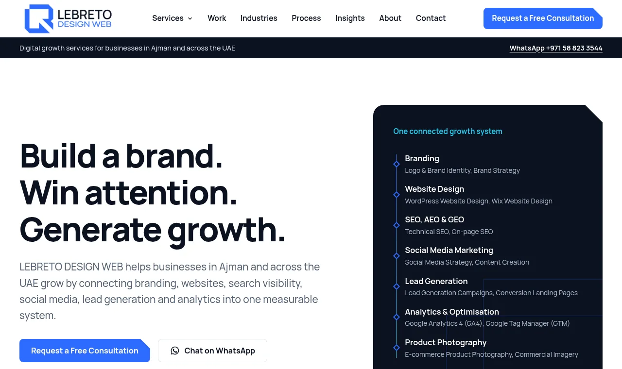
Primary buttons and feature panels carry the same diagonal corner as the monogram, turning a detail of the logo into a signature of the interface.
Rectangular frames taken from the letterforms structure content blocks and diagrams.
An oversized outline of the mark sits quietly behind page headers and banners at low strength, never competing with content.
Thin lines imply movement and connection, as in the connected-system graphic on the homepage.
Applications
The website is the most visible expression of the brand, so it was designed as a direct application of the guidelines, including accessibility and performance as brand-quality requirements.

A consistent set of layouts makes posts recognisable before the logo is noticed. Every post must demonstrate expertise, evidence or practical value.
| Application | Direction |
|---|---|
| Website | Blue actions, navy headlines, ice and white surfaces, one primary call to action per section |
| Social media | Monogram avatar, insight, process and service templates in square, portrait and story formats |
| Business stationery | White and navy compositions, blue mark, generous margins, optional spot UV on the monogram |
| Proposals and quotations | Clean tables, navy headings, blue totals, minimal decoration |
| Signage and uniforms | Raised blue monogram on white or navy; small embroidered monogram on navy garments |
| Merchandise | Symbol alone in one colour: embroidery, embossing or laser engraving |
The verbal identity follows the same rules as the visual one: clear, confident and specific. The campaign line Build a Brand. Win Attention. Generate Growth. describes the journey clients go through. The compact sign-off Design. Market. Grow. closes presentations and campaigns. Hype, unsupported superlatives and guaranteed-result claims are excluded by design.
The identity launched in September 2026, so there is not yet performance data to report, and this case study makes no claims about commercial results. An Arabic lockup and physical signage are planned as later phases and will be documented when complete.
The monogram interlocks the letters L and R into a single square form. A diagonal cut runs through it from upper left to lower right, suggesting forward movement and progress, while the strict geometry signals the precision expected from a digital and technical partner.
Yes. The white space inside the monogram forms a single arrow: a square head with a 45° shaft that exits through the lower-right corner. Read one way, it is growth breaking out of the box; read the other way, it is a pointer cursor aimed at the top-left, where every web page begins.
Straight and 45° edges align cleanly with the pixel grid, so the mark stays sharp at small sizes such as favicons and app icons. The same angles also generate the wider graphic language: chamfered buttons, cut-corner panels and directional lines all come from the logo’s geometry.
LEBRETO is the master brand and is set in Midnight Navy for authority. DESIGN WEB is the current descriptor and is set in Lebreto Blue. The contrast in weight and colour creates a clear hierarchy and allows the descriptor to evolve later without replacing the master brand.
Yes. The same process of discovery, concept development, testing at real sizes and documented guidelines is used for client identity projects. A focused logo and identity project typically takes three to six weeks, confirmed in the proposal.
Start with a free consultation about your brand, your audience and where you want the business to go.